Almost every artist who has a gallery wants to know who visits it and what artwork that the visitors find most interesting. If a gallery is virtual, like it is on Galeryst, an artist also would want to know where in the world the visitors are coming from. That is now possible on Galeryst! We’ve been working on a new analytics page on Galeryst that shows data about public galleries and artwork shared in them. For Galeryst subscribers, we are also showing visitor traffic and their engagement with the artwork in their galleries. Note, that there are many more non-public galleries on Galeryst that we do not share information about on the analytics page.
For the data visualization, we are using a tool called SandDance created by Microsoft Research and released through the Microsoft Garage, Microsoft’s small-scale innovation group. It is now available as an open-source component here. We chose SandDance because it offers a poetic 3D visualization with animation that went well with the 3D nature of Galeryst. SandDance invites users to explore the data visually in a fun way.
Visitor Analytics
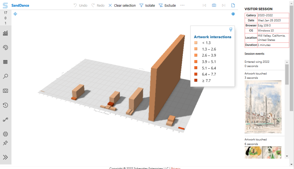
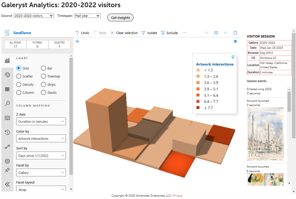
When a visitor enters a gallery, moves around, and clicks on artwork, that stream of data is recorded anonymously by Microsoft Application Insights. That data is then represented in a 3D column chart where the x axis is the date, the size of a block is the amount of time spent, and the color is the number of artwork touches (interactions). Clicking on a block shows detail about a the timeline of a visitor session on the rigth, wings entered, and artwork touched.
The fun of SandDance is that users can easily switch between 8 different chart types and see the same data in different ways. The same visitor data in a grid chart below.
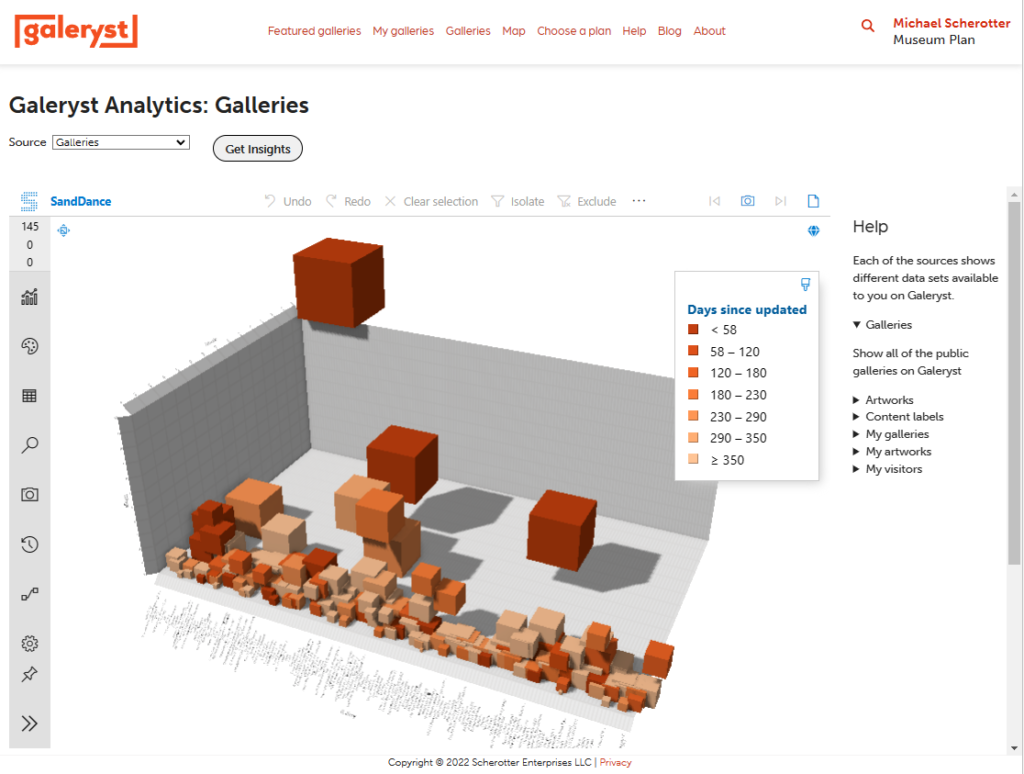
To get started with Galeryst analytics, sign in with your Adobe ID on Galeryst and you can see the Galleries, Artworks, and Content Labels data visualizations. If you are a paid subscriber at any level, you can see other charts with analytics for your galleries, your artwork and your visitors for all of your galleries or specific ones.
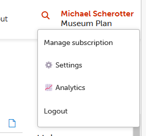
For users and subscribers, to see the Galeryst analytics and analytics for your galleries, go to the My Galleries page, and click on the menu button for any gallery and you should see a new Analytics in the user menu in the upper right:
Exploring Data
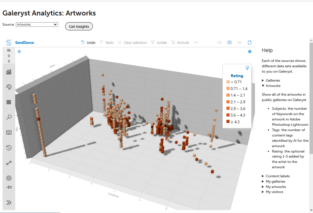
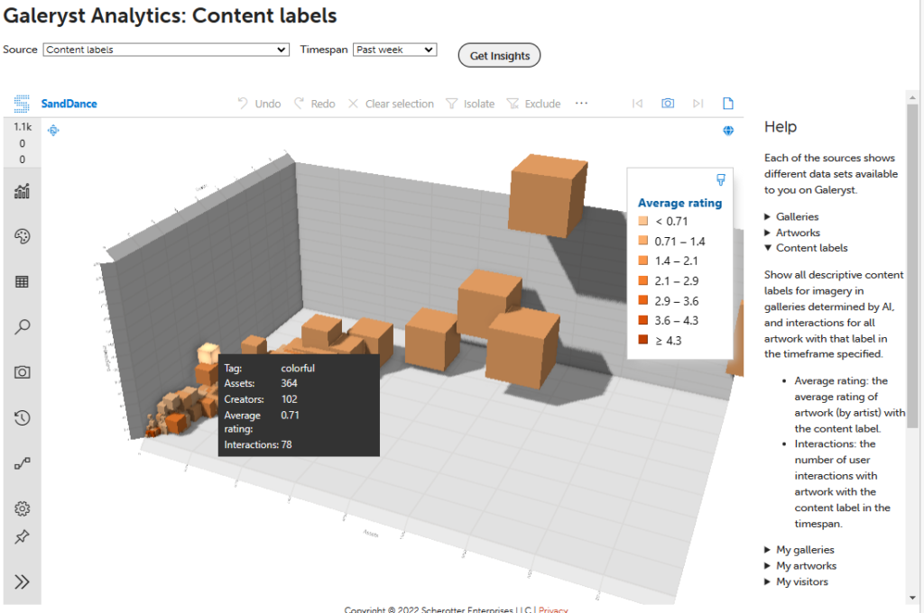
Exploring the data in Galeryst can be fun and insightful. If you explore the Content labels chart as shown below, you can see that artworks that have been label by AI as “colorful” got more interactions on average than many other types of content over the past week.
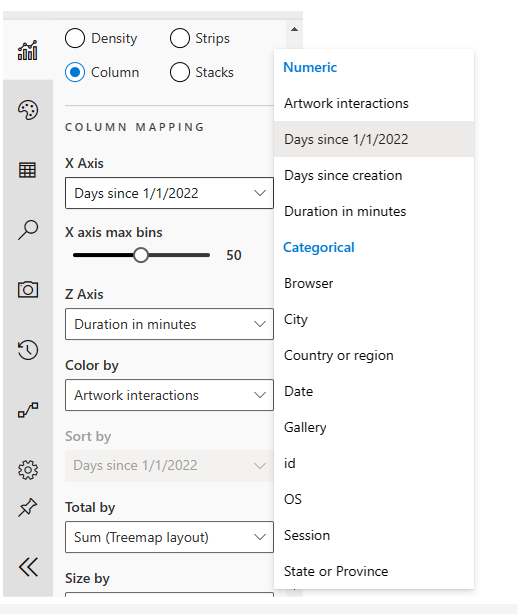
The SandDance control is meant to be used for data exploration so you can easily change which parameters are shown on which axis, how color is used, what color scheme is used, and how the sizes of cubes are determined, to name a few parameters. We invite you to play with the data, experiment and find a visualization that’s insightful for you. It’s very easy for us to add another visualization so please reach out if you have created a useful one that you’d like to share. We are looking into adding capabilities to enable users to save chart options as well.
Our goal in launching Galeryst was to enable any artist to create a beautiful gallery to share their artwork with the world. Now those artists can see what part of the world is appreciating their work. We invite you to create a gallery (anyone can create one for free), share it with the world, and explore the analytics that come from it. With the various subscription plans, you can create a gallery with an Adobe Photoshop Lightroom 7-day free trial, try out Galeryst for with a 1-month Artist plan, and see who comes to see your artwork!
Customization Update 1/27/2023
Enabling saving user customized charts was easier to do than I thought. Now Galeryst user can save any chart configuration as a custom chart. Artists can modify any of the parameters (chart type, column mapping, color schemes, etc.) and press the save button next to the source selector to save a custom chart. If you modify the chart, press the save button again to save updates to it.